Write a Code for data Clustring in Python and show outputs
person
brightness_auto
1 Answer
import pandas as pd
import matplotlib.pyplot as plt
import seaborn as sns
from sklearn.cluster import KMeans
df = pd.read_csv("Mall_Customers.csv")
X = df[['Age', 'Spending Score (1-100)']]
wcss = []
for i in range(1, 11):
kmeans = KMeans(n_clusters=i, init='k-means++', max_iter=500, n_init=20, random_state=0)
kmeans.fit(X)
wcss.append(kmeans.inertia_)
sns.set()
plt.plot(range(1, 11), wcss)
plt.title('Selecting the Numbeer of Clusters using the Elbow Method')
plt.xlabel('Clusters')
plt.ylabel('WCSS')
plt.show()
kmeans = KMeans(n_clusters=4, init='k-means++', max_iter=500, n_init=20, random_state=0)
y_pred = kmeans.fit_predict(X)
plt.scatter(X['Age'], X['Spending Score (1-100)'])
plt.ylabel("Spending Score")
plt.xlabel("Age")
plt.title("Clusters found by KMeans")
plt.scatter(kmeans.cluster_centers_[:, 0], kmeans.cluster_centers_[:, 1], s=300, c='black')
plt.show()
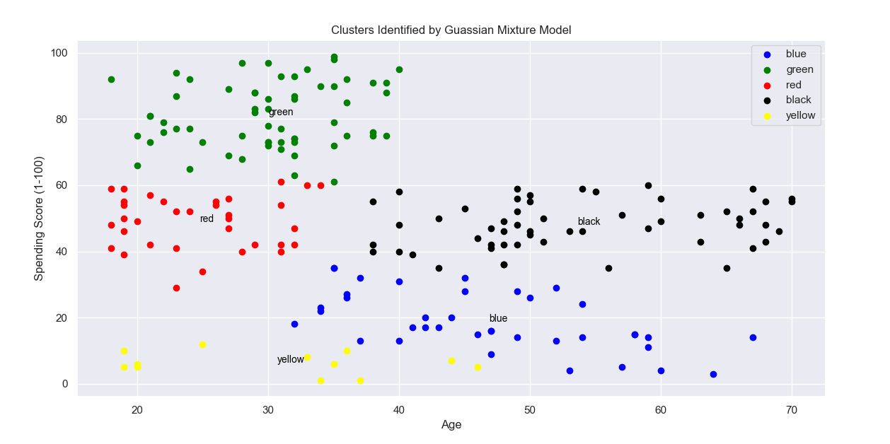
from sklearn.mixture import GaussianMixture
n_clusters = 5
gmm_model = GaussianMixture(n_components=n_clusters, random_state=5)
gmm_model.fit(X)
cluster_labels = gmm_model.predict(X)
X = pd.DataFrame(X)
X['cluster'] = cluster_labels
color=['blue','green','red', 'black', 'yellow']
labels =['blue','green','red', 'black', 'yellow']
for k in range(0,n_clusters):
data = X[X["cluster"]==k].copy()
plt.scatter(data["Age"],data["Spending Score (1-100)"],c=color[k])
plt.text(data["Age"].mean(), data["Spending Score (1-100)"].mean(), labels[k], fontsize=10, color='black')
plt.title("Clusters Identified by Guassian Mixture Model")
plt.ylabel("Spending Score (1-100)")
plt.xlabel("Age")
# Add legend
plt.legend(labels)
plt.show()
from sklearn.cluster import SpectralClustering
spectral_cluster_model= SpectralClustering(
n_clusters=5,
random_state=64,
n_neighbors=20,
affinity='nearest_neighbors'
)
X['cluster'] = spectral_cluster_model.fit_predict(X)
fig, ax = plt.subplots()
sns.scatterplot(x='Age', y='Spending Score (1-100)', data=X, hue='cluster', ax=ax)
ax.set(title='Spectral Clustering')